
Attleborough
Registered user
Hi,
Can anyone help me?
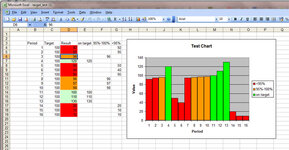
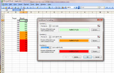
I have an Excel sheet where the calculation result cells have conditional formatting applied to them.
The conditional formating is straightforward enough - Green On Target, Amber less than 5% below target and Red for over 5% below target.
Does anyone know if it's possible to generate a chart from the results where the colums in the graph say, will retain the same colour formating as the result cells?
I'm using Excel 2003 and not very good at VB, so I'm hoping there is a work around I haven't found.
Cheers
A.
Can anyone help me?
I have an Excel sheet where the calculation result cells have conditional formatting applied to them.
The conditional formating is straightforward enough - Green On Target, Amber less than 5% below target and Red for over 5% below target.
Does anyone know if it's possible to generate a chart from the results where the colums in the graph say, will retain the same colour formating as the result cells?
I'm using Excel 2003 and not very good at VB, so I'm hoping there is a work around I haven't found.
Cheers
A.


")
")