Trippy
Guest
less of the fancy lettering
keep it tasteful
Give me an idea
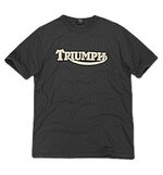
My favourite bike T-shirt.
Not that complicated really.


less of the fancy lettering
keep it tasteful
Give me an idea
")

Union flag puts me off
but good all the same

")

 is in my humble opinion in the wrong font, a script style rarely looks good on a arc and to some extent becomes very hard to read, and with that style the lower case e's look like a's
Southerndude

Have a look at this attachment. It's nice, simple and above all stylish.
 .
.
 ) planned on doing Exactly what you are doing.
 Southern dude
Should you go to print I'll have a 1150GSA one with the Scotland option but delete the "let's ride loggo"
Schultz


 you need to remember what bike you arrived on and what part of the uk you came from
Yeah, I'd go for that.
Simpler sounds better alright WALDIN's avatar looks about right from a detail/font point of view..
PS. I do think the Lets Ride sounds a bit naff. "We're Tossers" might not sell so well either.
Seriously, it looks good but needs a different phrase.
If you did a shirt with a generic GS image on a tri-colour with something like IRISH where Lets is written
and GS'er where ride is, that looked something like what you've shown, I'd be interested in a few.